 Avid readers will notice that I recently launched a rebranding of my personal website. Unlike many other professionals for whom building Websites is ancillary to their primary business, for me, building web applications that are scalable, perform, and offer the best in security, accessibility and usability are core strengths.
In the hopes that it inspires others to drive for better outcomes on their website, I share the techniques I used to achieve the performance I did. Beyond just turning some dashboard widget green from yellow or red, when compared against the performance of the site I had, how quickly the website loads speaks for itself.
Note that these techniques are invariant of site complexity, features, or size. It's merely a difference in scale of time and resources that needs to be invested to achieve similar outcomes; I will merely concede that some sites may have diminishing returns. If these techniques are over your head, then pass them on to your Web team as a checklist to implement, or reach out and I can help guide you towards people who can help. With those caveats out of the way, let's proceed!
Here are the objectives I set for my site's capabilities:
- Perform at or above the 95th percentile of websites
- No glaring HTML errors that can degrade experience or cause browser rendering issues
- It must use best practices to deliver content efficiently
- It must have basic SEO that makes the site readable and navigable by bots
- It must have basic Accessibility that makes the site readable and navigable by people of varying abilities
- Provide the best SSL/security options available
If I were to delve into every detail of every thing I did to achieve this outcome, this post would be two to three times longer than it already is. Rather, I will briefly outline what I did, why I did it, and provide some reasons why it's worth the effort.
Site Performance
To get my site to perform at 98th percentile or better (of sites Google generally crawls) required using a few techniques. The first and most crucial was to embrace a newer, faster, binary protocol for the Web called HTTP2. This is a server technology, so like the security section mentioned below, to make these changes, you need to either configure your web server (typically software with names like Apache, Nginx, or IIS) to support this faster protocol. And if you're told your server can't support this protocol, chances are it is so out of date, it indicates that your hosting capabilities are woefully out of date (by over 4-5 years) and need attention.One way to understand why HTTP2 is so much faster is to imagine if airlines had the ability to allow people to board the plane as they arrive at the gate instead of having a rush when boarding is announced. To pull this off, airlines would have to dedicate a gate to a single airplane, and keep the plane at the gate for the entire day of the flight. The strategy HTTP2 applies uses the same kinds of principles.
A secondary factor is to use a CDN (a "content delivery network" which is a strategy to locate assets your site needs at various globally distributed locations to ensure they can be loaded quickly for a visitor regardless of where they live) for just about every resource you can, and to ideally use a single one to minimize DNS lookups. Initially, I used several libraries (PureCSS and FontAwesome), and loaded them from multiple CDNs, but when I discovered that CloudFlare has all of the libraries I needed, I was able to use just one.
A third factor was to recognize that my largest assets, like most websites, was the size and number of images I was loading. There are lots of apps and services that shrink down image sizes, some lossy (affecting image quality) and some not. I personally used ImageOptim which happens to have a Mac app as well as a web service. The idea is, if a 500KB image and a 50KB image look indiscernible to your users, the 50KB one can be delivered 10 times faster. Every web site's workflow should include optimizing its images. Every graphic designer who works on the Web should know enough about image technology to know if a JPG, PNG or otherwise is the better medium to use, and how to optimize the settings to deliver the image in a reasonably efficient way.
The final strategy was to minimize unnecessary requests to various servers. There's a lot of small things I did to achieve these objectives, so I won't go into great detail on every one, as much as to give some hints about things you can do. All of these techniques are evident to HTML experts, so "view source" on my website will illustrate them in full. Here's a brief summary of what I did and the tools to pull it off.
- Eliminate favicon.ico calls to my server by delivering it with a data: URL (see my <head> tag).
- Use tools like Icomoon.io and FontSquirrel and CloudConvert to build a custom font, then base64 encode it and place it inline into my stylesheet for the "brands", and other svg style assets you see in various titles and footer elements on my site.
(Many websites load custom fonts to add stylistic elements, but the asset sizes of the full font are pretty huge; instead, you can create your own custom font that include only the svgs you need and then use an encoding called base64 to use data: URLs to deliver that custom font)
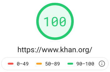
After using these and other minor techniques that the Google LightHouse Chrome plugin suggested, my site was quickly as fast or faster than 99% of all websites.
See Google's PageSpeed/LightHouse score for khan.org! Then run your own site to see how your brand/company does?
Best Practices
Google's Chrome plugin also provides other tools for Accessibility, Best Practices, and SEO. My suggestion here is to invest just enough time to ensure all of these get to a "green" status since they are all basically table stakes for a modern Web site to achieve a modicum of machine and human readability.Accessibility
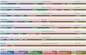
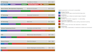
I gave this a special section because I used a separate tool to improve my site's a11y score. Namely, the "Axe". This free extension from Deque will give you insights on where your content is not easily readable by accessibility-challenged visitors. While this is not a guarantee of a fully accessible site, you've got no hope if even the automated tools are telling you your site is unfriendly to such visitors.In fact, the biggest challenge I faced was ensuring my site had sufficient contrast in various site features, and grappling with the biggest challenge I had forced me to reckon with a design problem on my site until I had an objectively better strategy for that page component.
As these images show, what often lurks under an Accessibility quagmire is actually poor design choices. My experience suggests that if you fix your accessibility impediments, you'll actually end up with an universally better design!


It goes to show that doing the right thing for one reason, ends up being the right thing for many other reasons. My Accessibility journey required fixing a lot of color contrast issues, so I thought I'd share the tool that helped me select more readable colors from my default color picks.
While I used Axe to remediate the bulk of my issues, the WAVE tool has an online validator that makes it easy to check a site.
See The WAVE tool's score for khan.org! Then run your own site to see how your brand/company does?
SSL/Security
To deliver the site with the best security options available, you should ensure your site is delivered via https. Once considered optional because it was pricy and complicated, today all of those objections and excuses have been eliminated. The Let's Encrypt project has made getting a certificate free, and tools like SSL Labs can show you what protocols you support and give your web server administrator (the guy in your web team that knows what Apache, nginx or IIS is and how to configure it properly) the cues they need to enable the right protocols to get a A+.See SSL Labs' score for khan.org! Then run your own site to see how your brand/company does?
HTML Validation
Last, but not least, writing semantic, properly validating HTML can speed up rendering because you're speaking the language browsers expect you to speak, rather than using HTML dialects browsers don't know how to render. If your site doesn't pass a validation check from the W3C's validator, addressing the issues has the added benefit of reminding how to write proper HTML.See W3C's score for khan.org! Then run your own site to see how your brand/company does?
In the end, these simple tools can help any site, and brand, and business improve the usability, functionality, performance, design, and compatibility of their online presence. Whether you are building a simple personal profile page, or a full scale professional business/brand presence, I'm curious if these, or other tips and tools, helped address what your biggest gaps were?

